




Cambridge Homes

Rebrand

Cambridge Homes

A house has to start somewhere. For Cambridge Homes, PKO built the brand around that simple idea: one core space, one strong foundation, then everything else grows from there.

Cambridge Homes needed an identity that could feel at home wherever people met the business, from a brochure to a flag outside a new build.

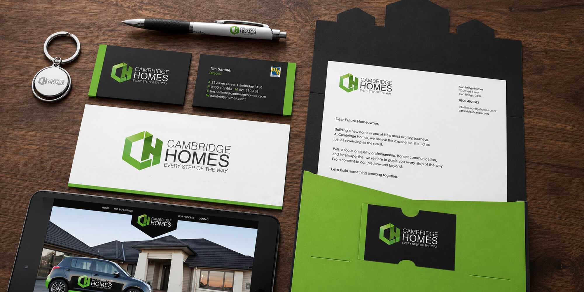
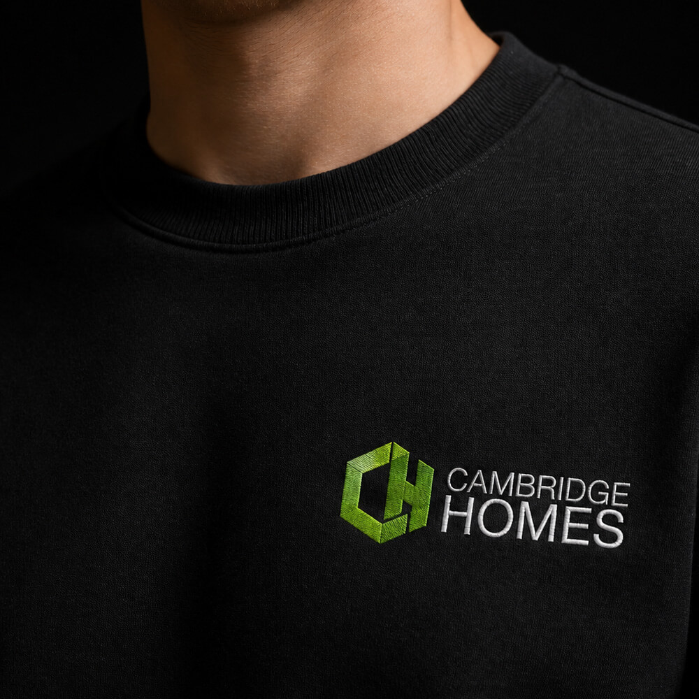
PKO built the logo around the way a home starts as a simple cube and grows outward. At its centre is the lounge, the heart of everyday life. That idea shaped a wider visual system across colour, flags, corflutes, leaflets, brochures, stationery and branded collateral.

The result is a recognisable identity that stays coherent across every application. A solid foundation for a business built around making homes.

Visit Website

Fancy a cuppa?

You don’t need a perfect brief. You don’t even need to know exactly what you need. That’s kind of the point.

Start a Chat