01
The Yarnsmen
Brand identity
A welcoming identity for a men’s mental health charity. The work needed room for humour and proper conversation, without losing sight of why the charity exists.
See The Yarnsmen project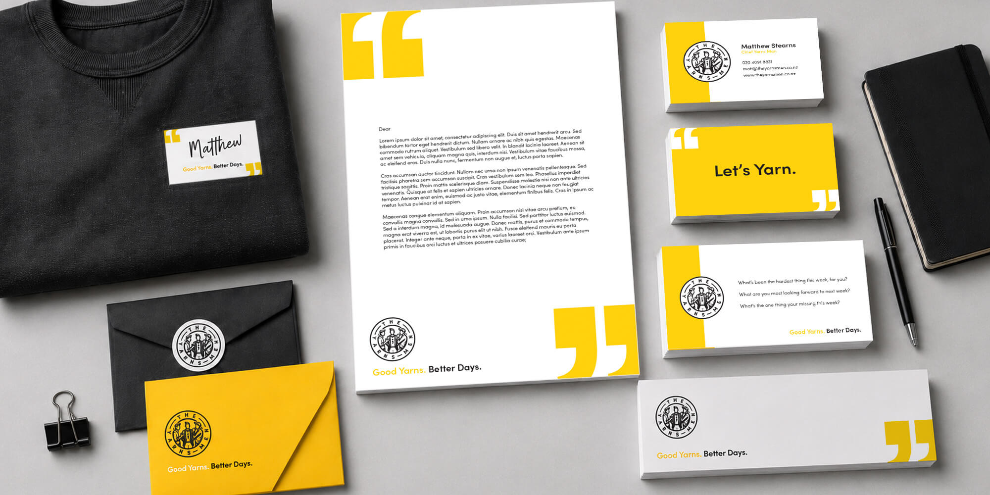

BRAND IDENTITY DESIGN · CHRISTCHURCH
PKO builds brand identities that look like they belong to the business behind them. Clear thinking first, then a visual system that holds together wherever people meet it.
A logo is important, but it has a lot of work to do on its own. The type, colour, imagery and way everything fits together are what make a brand recognisable when the logo is nowhere in sight.
PKO starts by understanding the business, its audience and what needs to change. From there, the identity is built around an idea with enough substance to work on a website, a sign, a shirt or the smallest bit of print.
For a new business or an existing one ready for a rethink, the aim is the same: a brand that feels right and works in the real world.
THE WORK
We look at the business, its audience and the job the brand needs to do. Good design has something to say before it chooses a colour.
PKO develops the logo, typography, colour, imagery direction and supporting elements as one connected identity.
The identity is applied where it matters, from digital and print to signage, packaging and campaign materials, depending on what the business needs.
SELECTED WORK
A few of the ways PKO has helped businesses and organisations look more like themselves.
Brand identity
A welcoming identity for a men’s mental health charity. The work needed room for humour and proper conversation, without losing sight of why the charity exists.
See The Yarnsmen projectBrand identity
A simple idea at the centre of a full identity. The logo begins with the shape of a home and the lounge at its heart, then carries across print, signage and more.
See the Cambridge Homes project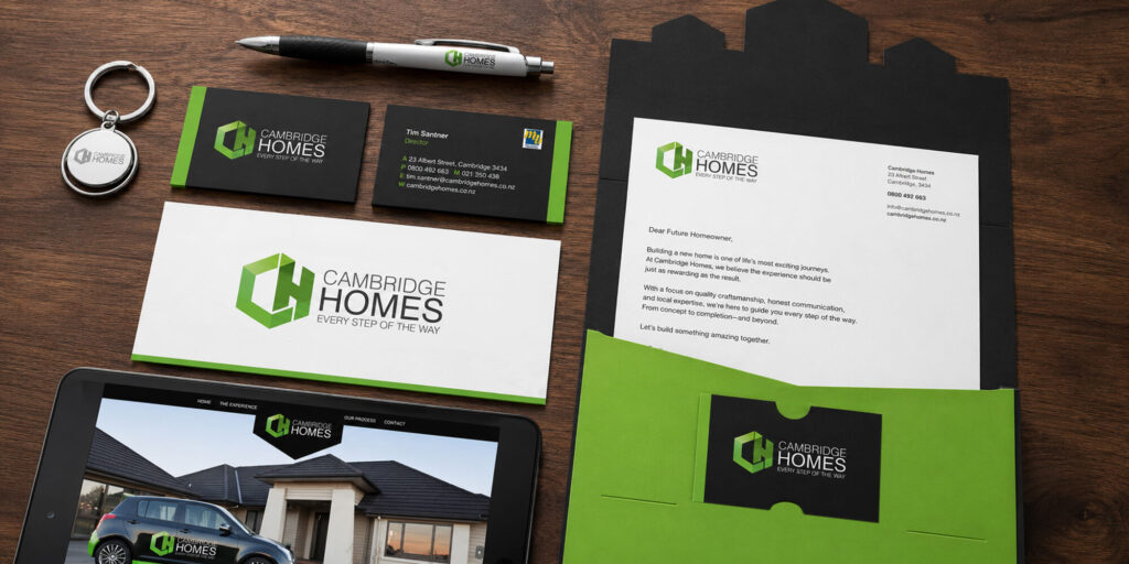
Brand identity
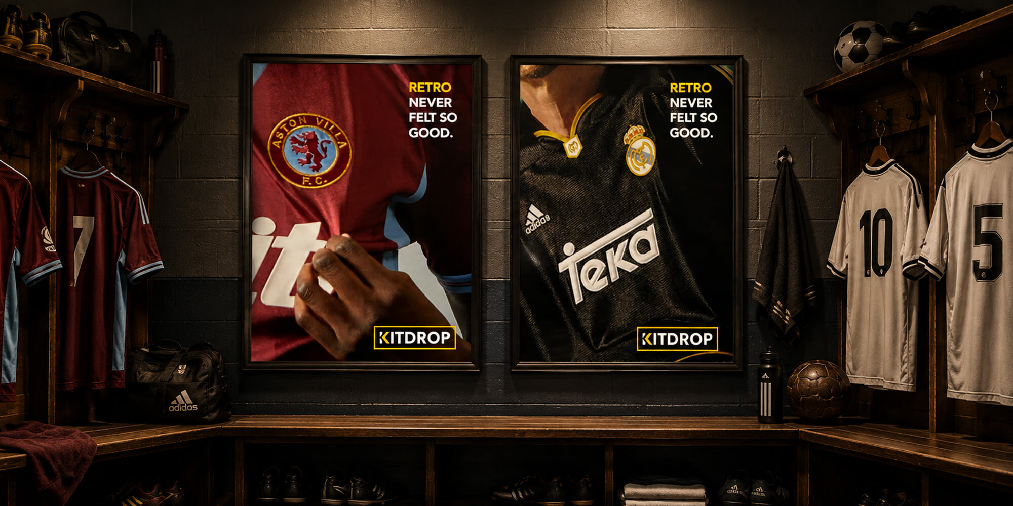
Vintage football shirts have plenty of personality already. PKO gave KitDrop a confident identity that lets the shirts lead, with a drop worked into the K.
See the KitDrop projectGOOD TO KNOW
No. The logo is one part of a wider visual system. What that system includes depends on where your brand needs to show up.
Yes. Sometimes the foundations are sound and the brand needs a more consistent way to use them. Sometimes it needs a bigger rethink. We’ll work that out before reaching for the drawing tools.
That’s fine. Getting clear on the problem is part of the job. You can start with what you know and we’ll go from there.
Tell PKO what you’re working on. No perfect brief required.
Start a Chat