Coneburn

Branding

Coneburn

Coneburn Industrial sits beneath the Remarkables, so the brand had a fairly high bar to clear.

Coneburn Industrial is a premium industrial development near Queenstown, with the Remarkables as its backdrop. The brief was to give the place a distinct identity without reaching for the usual warehouse graphics or industrial blue.

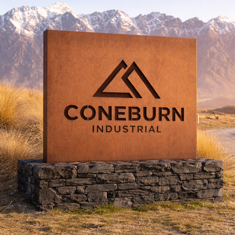
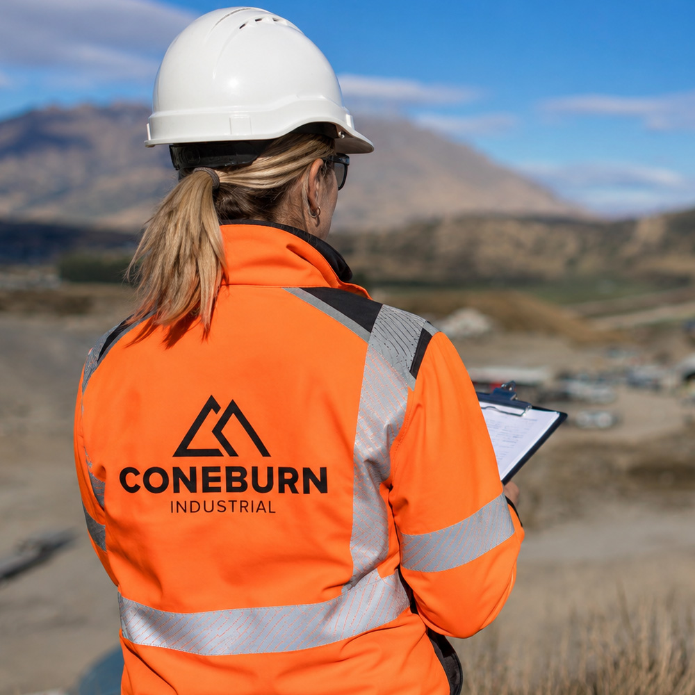
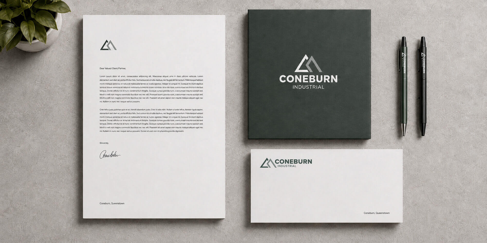
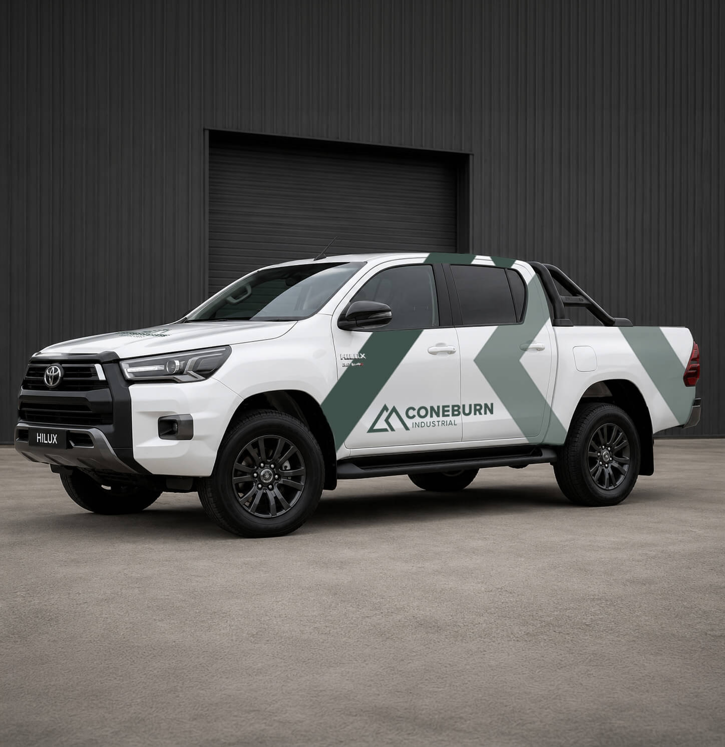
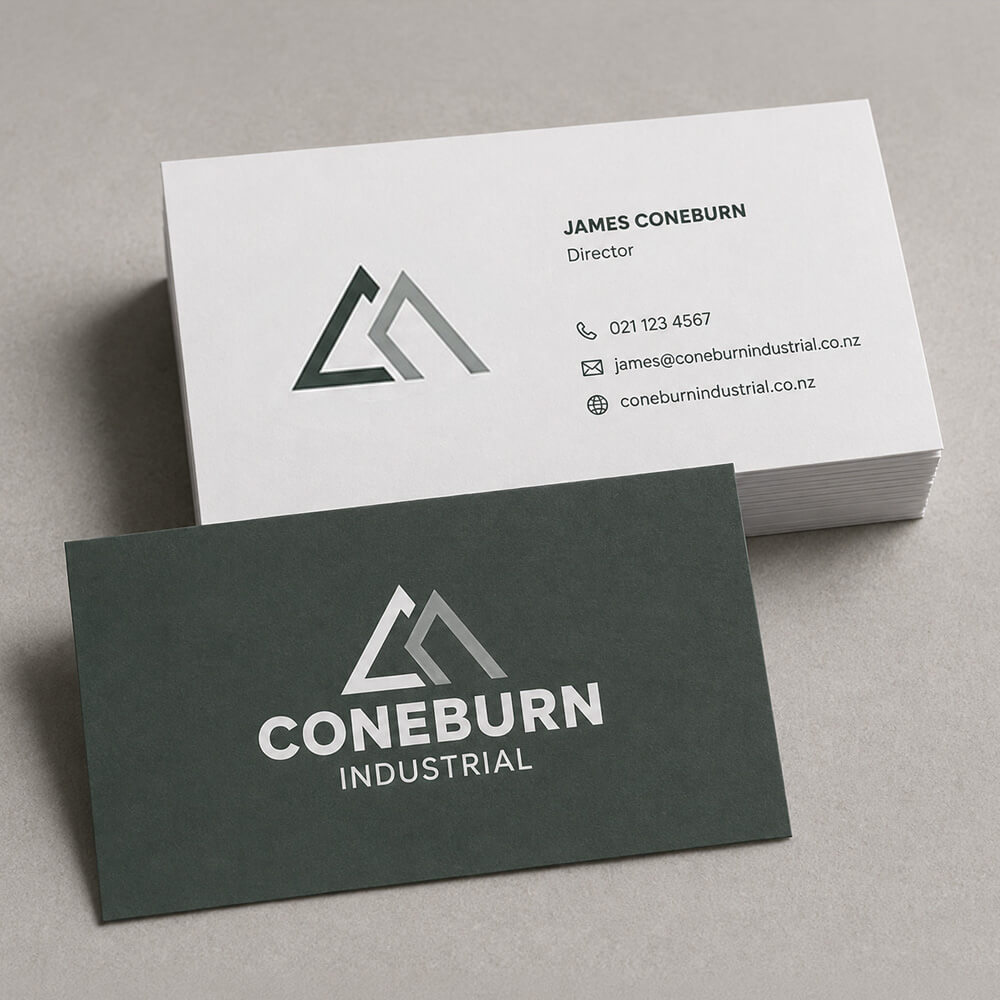
PKO drew from the surrounding peaks, the land and the infrastructure beneath it. The logo suggests the mountains above ground, while the right-hand form also reaches into the earth like foundations, drilling and pipework. That link between landscape and structure shaped the wider identity across signage, stationery, workwear and site collateral.

The result is a brand that feels grounded in its location and confident in its purpose. Industrial, with its boots on, but properly dressed for the occasion.

Fancy a cuppa?

You don’t need a perfect brief. You don’t even need to know exactly what you need. That’s kind of the point.

Start a Chat