
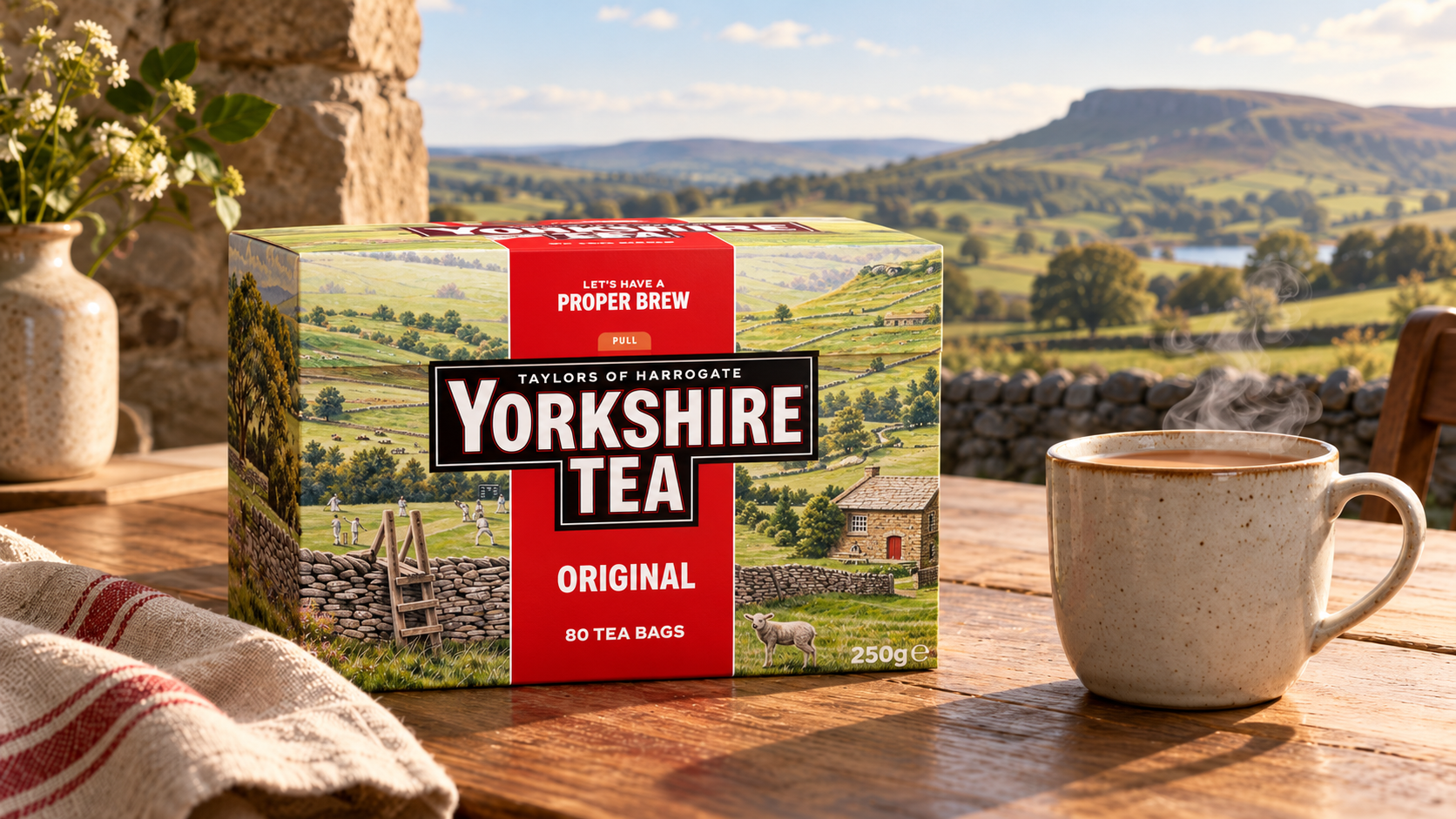
Brewing Something Better Without Ruining the Recipe
How do you redesign one of Britain’s most recognisable tea brands without upsetting the people who have been staring at the same box every morning for years?
You change it carefully.
Very carefully.
Because Yorkshire Tea doesn’t have a recognition problem. It has the opposite problem. People already know exactly what it looks like.
That’s what makes its recent refresh so interesting.
This isn’t a brand being dragged into the modern world. It isn’t a dramatic reinvention. It isn’t somebody deciding the answer to everything is a sans serif font, a beige colour palette and a manifesto about “new beginnings”.
It’s much more restrained than that.
And, in a lot of ways, much harder.
The easiest thing would have been to change too much
When a brand has been around for years, there is always a temptation to make the redesign feel obviously different.
You want the before and after to look impressive. You want people to see the work. You want the client presentation to have that big reveal moment where everyone nods and says: “Wow. That’s really changed.”
But that isn’t always the job.
Sometimes the job is to make something better without making it feel unfamiliar.
That is a much more subtle challenge.
Yorkshire Tea already had a strong identity. The landscape. The colours. The tone. The slightly eccentric Britishness. The sense that this is a brand that knows exactly what it is and has no interest in pretending to be anything else.
So the clever part of the refresh is that it doesn’t throw any of that away.
It sharpens it.
This is where restraint matters
The work by Turner Duckworth feels like a good example of knowing when to stop.
The familiar Yorkshire landscape is still there. The overall character is still there. The warmth is still there.
But the details have been refined.
The illustration has been revisited with artist Andrew Hutchinson, the lettering has been re-crafted, and the wider identity has been made more flexible so the brand can work better across packaging, campaigns and digital.
That sounds simple.
It isn’t.
Because when you are working with something people already recognise, every small change matters more.
Move something too far. Simplify it too much. Modernise it too aggressively.
And suddenly the thing everyone liked about it disappears.
That is the danger.
Familiarity is a design asset
One of the things I think designers sometimes underestimate is how valuable familiarity can be.
Not everything needs to feel new.
Sometimes recognition is doing a lot of the heavy lifting.
You see the red box. You see the landscape. You see Yorkshire Tea.
Done.
That instant recognition is incredibly valuable.
And once you have it, you should be very careful about sacrificing it just because somebody wants the brand to feel “fresh”.
Fresh is useful.
Familiar is powerful.
The best rebrands often understand how to balance both.
The new identity still feels like Yorkshire Tea
That is probably the biggest compliment I can give it.
It still feels like the same brand.
The personality hasn’t been polished out of it.
It hasn’t suddenly become too minimal, too clean or too self-conscious.
It still feels British. Still slightly odd. Still confident enough to have a sense of humour. Still the sort of brand that could make a completely ridiculous advert and somehow get away with it.
That consistency matters.
A good visual identity shouldn’t just look nice.
It should feel like the brand.
And Yorkshire Tea has always had a very distinct personality.
The refresh respects that.
This is the bit I really like
There is something quite satisfying about a redesign that doesn’t feel desperate to prove itself.
No massive reset.
No dramatic repositioning.
No pretending the last twenty years were all a terrible mistake.
Just:
What is already working?
What can we make better?
What should we absolutely leave alone?
That feels like a much healthier way to approach branding.
Because not every business needs a revolution.
Sometimes you just need to improve the recipe.
The tea analogy is annoyingly perfect
Which is convenient.
Because if you are making tea, the answer to improving it usually isn’t throwing everything away and starting with orange juice.
You tweak it.
Better ingredients.
Better timing.
Better balance.
You keep the thing that people already like.
Branding can work the same way.
The strongest refreshes don’t always shout.
Sometimes they just make everything feel slightly more considered.
More consistent.
More useful.
More recognisable.
And that is exactly what this feels like.
Knowing what not to change is part of the job
I think that is the real lesson here.
Designers are usually brought in to change things.
So naturally, we want to change things.
But part of being good at the job is knowing when not to.
Sometimes the most valuable decision is leaving something alone.
Yorkshire Tea already had equity in its packaging, its colours and its character.
The refresh respects that.
It doesn’t try to be clever for the sake of being clever.
It just makes the brand work harder.
And I think that is why it works.
Yorkshire Tea didn’t need a new recipe.
It just needed a slightly better brew.