
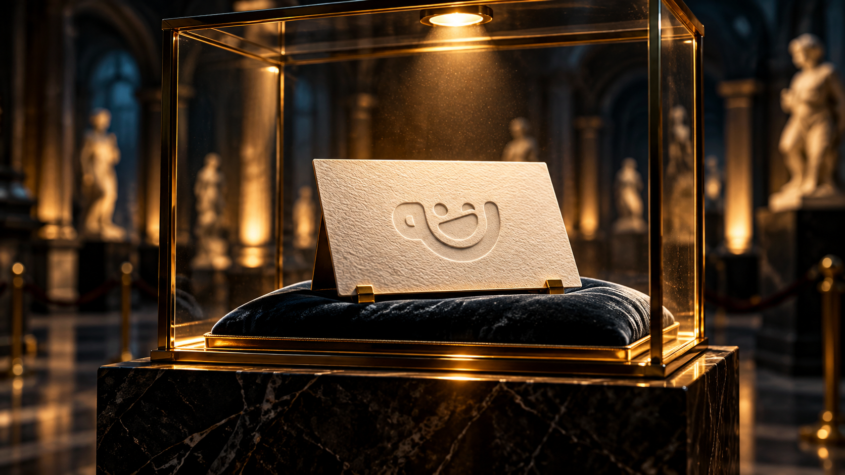
Paper Became a Luxury
We spent about twenty years trying to kill paper.
Menus became QR codes.
Tickets disappeared into our phones.
Brochures became PDFs nobody opens.
Business cards became, “I’ll just add you on LinkedIn.”
And then something weird happened.
Paper got good again.
Not useful.
Not practical.
Good.
The sort of good where somebody hands you a beautifully printed card and, for a brief moment, you turn into the kind of person who says things like:
“Lovely stock.”
Which is not something normal people say.
I lost an entire day to a business card
Years ago, I spent basically a full day choosing paper for a business card.
A day.
For paper.
Even writing that now, I’m aware it sounds like I had nothing better to do.
But I knew exactly what I wanted.
I wanted texture.
I wanted it to feel natural.
I wanted it to feel expensive, but not in that horrible glossy way that makes something look like it came free with a mobile phone contract.
I wanted someone to take the card and notice it.
Not consciously.
Just feel it.
And that’s exactly what happened.
People would take it, run their thumb across it and say:
“This is really nice.”
Not, “Great logo.”
Not, “Love the typography.”
Not, “Excellent kerning, mate.”
The paper.
That was the bit they noticed.
And I loved that.
Because it meant the design was doing something before they’d even really looked at it.
Screens can’t do that
Digital design is incredible.
I love digital design.
You can make things move, react, change, animate, fade, slide, hover and gently drift around the screen for reasons nobody can quite explain.
But it still can’t do one very basic thing.
It can’t make someone go:
“Ooooh.”
While rubbing it between their fingers.
You can fake texture on a screen.
You can photograph it beautifully.
You can add grain.
You can add shadows.
You can spend three hours making a piece of flat UI look like recycled card.
It is still a screen.
That’s the bit physical design has going for it.
It exists.
We made convenience boring
This is the strange part.
Digital won because it was convenient.
And rightly so.
I don’t want every restaurant to hand me a 16-page laminated menu covered in photos of lasagne.
I don’t want to carry printed airline tickets.
I definitely don’t want invoices arriving by post.
But once everything becomes convenient, convenience stops feeling special.
It just becomes the minimum.
Tap.
Swipe.
Scroll.
Delete.
Ignore.
Repeat.
Physical stuff interrupts that rhythm.
Someone hands you something.
You actually look at it.
You turn it over.
You feel it.
You might even keep it.
That last bit matters.
There is cardboard in my house that I am apparently emotionally attached to
You know the box.
The one your phone came in.
Or your headphones.
Or some ridiculously over-designed skincare product.
You’ve taken the product out.
The box is now completely useless.
And yet there it is.
Still in a drawer.
Because it’s too nice to throw away.
That is absurd.
But it also tells you something.
Good physical design creates attachment.
Not because it’s practical.
Because it feels considered.
Someone thought about the weight.
The finish.
The opening.
The little bit where the lid slows down at the end.
The tiny embossed logo.
The bit of tissue paper you absolutely do not need.
And somehow all of that makes the thing feel more valuable.
Print didn’t die
People said print was dead for years.
I don’t think it died.
I think it just stopped being everywhere.
And that made it better.
When everything was printed, print was just normal.
Now, when someone chooses to print something properly, it feels intentional.
A thick business card.
A beautifully produced brochure.
A book with proper paper.
A menu you don’t have to pinch and zoom with greasy fingers.
It stands out because it doesn’t feel disposable.
Which is funny.
We got rid of paper because it felt old.
Now it feels premium.
The material is part of the idea
This is the bit I think gets overlooked.
The design is not just what is printed on the thing.
The thing itself is part of the design.
The weight matters.
The texture matters.
The way it folds matters.
The way light hits it matters.
Even the noise it makes matters.
That sounds horribly design-y.
But it’s true.
My business card didn’t work because the logo was amazing.
It worked because the card felt how I wanted the business to feel.
Natural.
Considered.
A bit premium.
Not shouty.
The material was doing part of the branding.
And once you notice that, you start seeing it everywhere.
Maybe that’s why physical feels luxurious now
Luxury used to mean gold foil, massive boxes and something wrapped in far too many layers.
Now sometimes luxury is just:
Someone bothered.
Someone chose the right paper.
Someone cared about the finish.
Someone didn’t send you a PDF.
And because so much of our day disappears into the same glowing rectangle, anything outside that rectangle suddenly has an advantage.
You notice it.
You remember it.
You might even keep it.
Which means after years of trying to get rid of paper, we somehow managed to make it desirable again.
Quite an achievement really.
We spent twenty years trying to kill it.
And accidentally made paper a Luxury.