
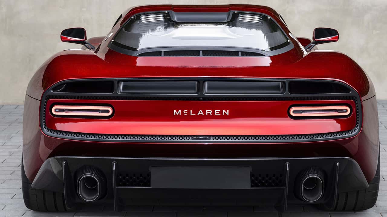
McLaren Went Backwards to Move Forward
I’ve always loved cars.
My dad was a mechanic, so I grew up around them. Cars being fixed, bits of engine on benches, tools everywhere, someone swearing because a bolt had clearly decided it wanted to stay exactly where it was.
I probably learned to appreciate a well-designed machine long before I knew what kerning was.
So when McLaren revealed its new identity, I was always going to pay attention.
And I bloody love it.
Not because it’s flashy.
Not because it’s doing something incredibly clever.
Not because there’s a 97-page brand deck explaining how the angle of the C represents velocity, innovation and “the future of movement”.
I love it because it’s simple.
Really simple.
And underneath that simplicity is a brilliant little story.
McLaren went looking for its future and found it hanging above a garage in Auckland.
The best bit isn’t actually new
The new wordmark takes inspiration from the sign above the service station owned by Bruce McLaren’s parents, Les and Ruth, in Remuera, Auckland. That garage was where Bruce grew up around cars, learned how they worked, and built the modified Austin Seven that helped kick off his racing career.
That instantly made me like it more.
Maybe because I grew up with a mechanic for a dad, garages have always felt like more than somewhere you get an oil change and a bill you weren’t emotionally prepared for.
They’re places where people make things work.
Where problems get pulled apart.
Where someone stares at something for ten minutes, says absolutely nothing, then suddenly knows what’s wrong with it.
Usually followed by more swearing.
There’s something lovely about McLaren going back to that kind of beginning.
Not a wind tunnel.
Not a glossy boardroom.
Not some futuristic white room with people wearing very expensive trainers.
A family garage.
That feels right.
And then they didn’t overdo it
This is probably my favourite bit.
They didn’t dig up the old garage sign and turn McLaren into a nostalgia brand.
They didn’t slap a vintage filter over everything and start pretending it was 1963 again.
They just took the idea and cleaned it up.
The new identity uses a bespoke typeface called McLaren Sans, and the little underline beneath the C comes from the original service station signage. The wider identity was developed across McLaren Racing and McLaren Automotive using McLaren’s own archives.
That little line is tiny.
Almost annoyingly tiny.
But once you know where it came from, it becomes the whole thing.
It has a reason to be there.
And I’ll take one tiny detail with a proper story behind it over another swoosh, gradient or “dynamic motion device” any day.
Simple doesn’t mean boring
Whenever a big company simplifies a logo, somebody immediately says:
“They’ve just used a sans serif.”
Which is technically true in the same way that saying “my dad just fixed cars” is technically true.
You’re leaving quite a lot out.
The simplicity works because McLaren doesn’t need the wordmark to do all the work.
It already has papaya.
It has the Speedmark.
It has the Speedy Kiwi.
It has F1.
It has supercars.
It has decades of people associating the name with speed, engineering and things that cost more than my house.
The logo can afford to calm down a bit.
That’s the bit I like.
It doesn’t look like it’s trying to prove anything.
We ask logos to do far too much
Designers are terrible for this.
We’ll sit in meetings asking whether the logo “communicates innovation”.
Or “feels agile”.
Or “captures the essence of the customer journey”.
Sometimes it’s a logo.
It does not need to explain the entire company before lunch.
A brand is bigger than that.
The logo is one bit.
The colours are another.
The photography, tone, typography, products, environments and little repeated details do the rest.
McLaren understands that.
The Speedmark is still there. The Speedy Kiwi is still there. Papaya is still doing what papaya does. The identity hasn’t thrown everything in the bin just so someone can say the word “transformation” in a presentation.
That feels sensible.
Refresh the system.
Don’t set fire to the garage.
The history is already doing half the work
McLaren’s visual history is great.
The original crest from 1964 featured a Kiwi and was designed by motorsport artist Michael Turner. The Speedy Kiwi came later, designed by Doug Eyre, and Raymond Loewy was involved in McLaren’s identity in the 1980s.
That’s a pretty decent archive to rummage through.
So why invent some completely new origin story?
You’ve already got one.
A proper one.
With racing, family, New Zealand, old signage and actual history.
That’s much more interesting than “the three lines represent performance, people and purpose”.
It feels more grown up
The old McLaren wordmark felt fast.
Which, to be fair, is useful if you’re McLaren.
But the new one feels quieter.
Calmer.
More confident.
It doesn’t need to lean forward and scream:
“LOOK HOW FAST WE ARE.”
We know.
The cars are doing a fairly decent job of communicating that.
There’s something much more premium about a brand that doesn’t feel the need to explain itself every five seconds.
It feels like McLaren has stopped revving the engine at the traffic lights.
It knows what it’s driving.
The timing makes sense too
McLaren is changing.
The identity is meant to bring Racing and Automotive closer together visually, while the wider business is expanding its manufacturing and engineering ambitions and moving beyond the traditional two-seat supercar world.
So the logo now has to work in a lot more places.
F1 car.
Road car.
Clothing.
Digital.
Buildings.
Whatever weird, expensive thing McLaren decides to make next.
That’s where simplicity becomes useful.
Simple travels well.
Simple scales.
Simple gives the rest of the brand room to do something interesting.
This is the kind of rebrand I love
There’s no giant trick.
No hidden animal.
No negative-space arrow.
No seven-part diagram explaining why every corner radius has been “strategically optimised”.
It’s a name.
Drawn beautifully.
With one little detail underneath the C.
And that detail takes you all the way back to Bruce McLaren’s family garage in Auckland.
That’s enough.
More than enough, actually.
And maybe that’s why it hits me a bit more personally.
I grew up around cars because of my dad.
McLaren grew out of Bruce being around cars because of his parents.
Very different scales, obviously.
My childhood garage did not lead to Formula One.
But I understand that feeling of learning by being around things.
Watching.
Listening.
Seeing how things are put together.
Working out why something works.
And occasionally why something very definitely doesn’t.
That same curiosity is probably why I ended up in design.
Cars and brands aren’t that different really.
Pull them apart.
Understand the pieces.
Put them back together properly.
And try not to leave any bolts on the floor.
McLaren didn’t need to invent a new story.
It just needed to notice the one it already had.
That’s why this identity works for me.
It went backwards just far enough to Move Forward.