
McDonald’s Removed Almost Everything. The Result Says Almost Nothing
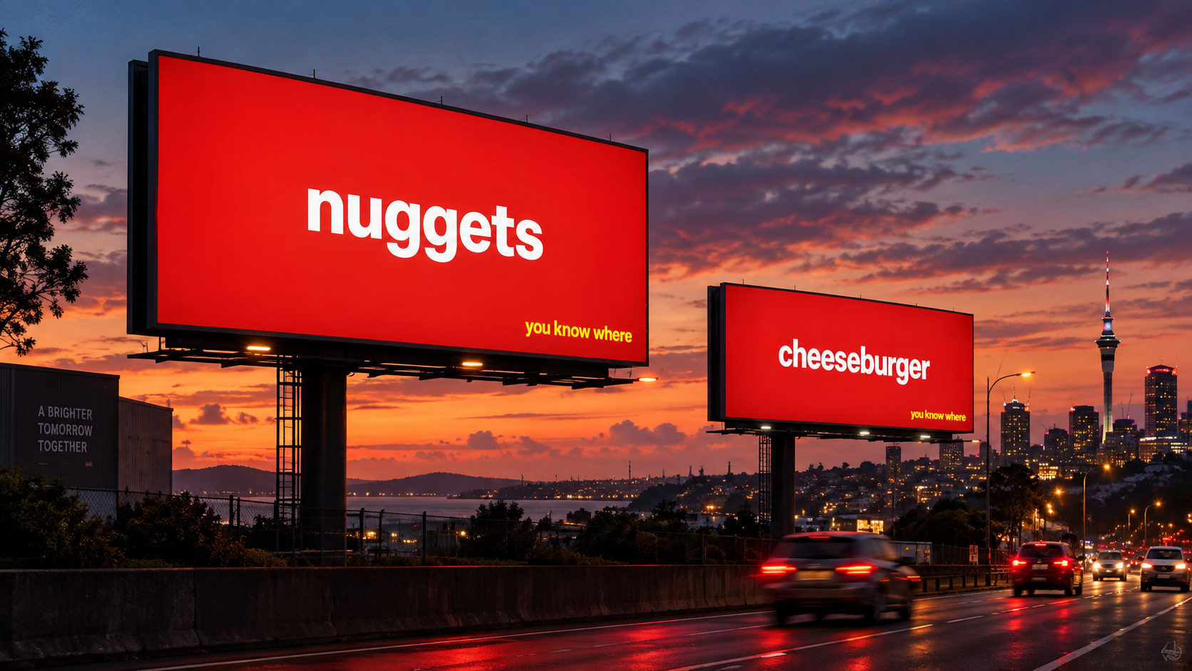
I saw McDonald’s New Zealand’s latest outdoor campaign and immediately thought, that’s bloody clever.
No Golden Arches.
No picture of a burger with cheese cascading down the side.
No perfectly placed fries.
Not even the word McDonald’s.
Just:
nuggets
Or:
cheeseburger
White type. Red background. A tiny line in yellow saying:
you know where
And that’s it.
Yet you know exactly who the advert is for.
McDonald’s New Zealand launched the national outdoor campaign, called You Know Where, with McCann New Zealand. The campaign uses familiar menu names such as fries, nuggets, cheeseburger, hotcakes, apple pie and sundae, while deliberately removing the logo, product photography and even the Golden Arches.
I absolutely love it.
How much can you remove?
Designers spend a lot of time talking about simplicity.
Strip it back.
Remove what you don’t need.
Give things space.
But there’s stripping something back, and then there’s basically removing the entire advert.
That’s what makes this campaign so good.
The product names aren’t even uniquely McDonald’s.
They haven’t written Big Mac.
They’ve written cheeseburger.
Loads of places sell cheeseburgers.
Plenty of places sell nuggets.
Everyone sells fries.
Yet put one of those words in white on that particular red background and your brain does the branding for them.
You already know where.
That is an unbelievable position for a brand to be in.
The logo isn’t the brand
This is probably the bit I find most interesting as a designer.
We can get incredibly precious about logos.
Move it three pixels to the left.
Make it bigger.
Give it more clear space.
Make sure it’s always visible.
And obviously a logo is important.
But this campaign is a brilliant example of something much bigger.
Your brand isn’t your logo.
It’s everything people have learnt to associate with you over time.
The colours.
The language.
The products.
The advertising.
The packaging.
The experience.
Even the names of the things you sell.
McDonald’s has spent decades building those associations.
So now they can remove arguably their most recognisable asset and people still know exactly who is talking to them.
That’s brand equity doing an enormous amount of heavy lifting.
The confidence is the idea
There’s another thing I love about it.
It doesn’t desperately try to get your attention.
There’s no:
NEW!
No giant price.
No exploding burger.
No person laughing slightly too enthusiastically while holding a chip.
It just sits there.
nuggets
You know where.
There’s an arrogance to it.
But the good kind.
It’s basically McDonald’s saying:
We don’t need to tell you who we are.
And annoyingly, they’re right.
That trust is what makes the idea work.
If a completely unknown burger shop ran the same advert, you’d probably just wonder why someone had paid thousands of dollars for a billboard that said “cheeseburger”.
McDonald’s can do it because of everything that came before it.
Simple isn’t the same as easy
This is something I think gets misunderstood in design all the time.
When something looks this simple, it’s easy to think:
Well, I could have done that.
And technically, yes.
Anybody can type the word nuggets onto a red rectangle.
That isn’t the clever bit.
The clever bit is recognising that you can.
Knowing what can be removed.
Having enough understanding of the brand to realise the idea won’t collapse without the logo.
And then having enough confidence not to start adding things back in because somebody gets nervous.
“Should we just put a tiny Golden Arch in the corner?”
No.
“Maybe show half a nugget?”
No.
“Could we add the app?”
Please stop.
Knowing when you’ve got enough is a massive part of design.
Sometimes the hardest thing to do is leave something alone.
It also shows what consistency buys you
Brands often get bored with themselves long before customers do.
They want a new colour.
A new font.
A fresh direction.
Something completely different.
And sometimes that’s absolutely the right thing to do.
But campaigns like this show the value of consistently building recognisable assets over years and years.
McDonald’s red and yellow aren’t exciting because somebody chose a nice colour palette.
They’re exciting because they mean something.
You’ve seen them thousands of times.
The same goes for the products.
Fries.
Cheeseburger.
Nuggets.
Those words have been attached to McDonald’s for so long that they’ve become part of the brand language in their own right.
That doesn’t happen from one campaign.
It happens through repetition.
Consistency.
And a ridiculous amount of time.
Is it groundbreaking?
I think it is.
Not because nobody has ever made an advert without a logo before.
Plenty of brands have played with removing familiar assets.
What feels groundbreaking is how little this campaign needs to give you before your brain fills in everything else.
There’s almost nothing there.
And yet somehow the McDonald’s brand feels enormous.
That’s the bit I keep coming back to.
We spend so much time in branding asking what we should add.
Maybe sometimes the much better question is:
What can we take away?
Because if people still know exactly who you are when the logo disappears, you’ve built something far more valuable than a nice logo.
You’ve built a brand that can say Almost Nothing.