I Try Not to Design Anything Until I Understand the Real Problem
I Try Not to Design Anything Until I Understand the Real Problem
Opening Illustrator is dangerous.
Not in a this software may harm your computer kind of way. More in a I’ve moved boxes around for three hours and still don’t know what I’m actually trying to solve kind of way. I’ve done it plenty of times.
You get a brief. You immediately start thinking about fonts. Colours. Logos. Images. Then, somewhere around version 17, you realise you haven’t really answered the original problem.
These days I try to delay the designing for as long as possible.
Before anything else, I want a chat
This is basically where the whole idea behind Pop Kettle On came from.
Before I design something, I want to understand it. What are we trying to achieve? Who needs to care? What isn’t working at the moment? Why are we changing it? What does success actually look like? And occasionally: “Are we sure you actually need this?” That last question can save everyone a surprising amount of money.
I don’t think a creative brief needs to be a 47-page strategy document. Some of the most useful information I’ve ever had from a client has come from an offhand comment halfway through a chat. Something they don’t realise is important.
That’s usually the interesting bit.
Clients don’t always have a design problem
Someone might come to you asking for a new logo. But the logo might be perfectly fine.
Maybe customers don’t understand what the company does. Maybe everything around the logo is inconsistent. Maybe the website is confusing. Maybe their product looks exactly like six competitors. Making the logo nicer doesn’t fix any of that.
It’s easy as a designer to solve the thing you’ve been asked to solve. It’s much more useful to work out whether it’s the right thing to solve. And that changes the process completely.
I like simple ideas
I’m a big believer that if I can’t explain the thinking behind something without using a collection of ridiculous agency words, the idea probably isn’t there yet.
Good ideas usually sound obvious afterwards. That’s part of what makes them good.
I’ve worked on identities where the best route has come from something incredibly simple about the business, the location, the product or the people behind it. You find that one thing. Then you build from there.
It’s why I like stripping projects back rather than adding more and more stuff. More colours don’t fix a weak idea. Neither does another font. Neither does putting a gradient on it. Although gradients do give it a bloody good go.
The ugly stage is important
There’s also a point in every project where everything looks terrible. I think that’s healthy.
Sketches.
Half-built layouts.
Type experiments.
Screens full of things that will absolutely never see daylight.
That’s where you’re working things out.
One of the dangers of modern design tools, particularly with AI entering the mix, is that it’s becoming incredibly easy to make things look finished before the thinking is finished.
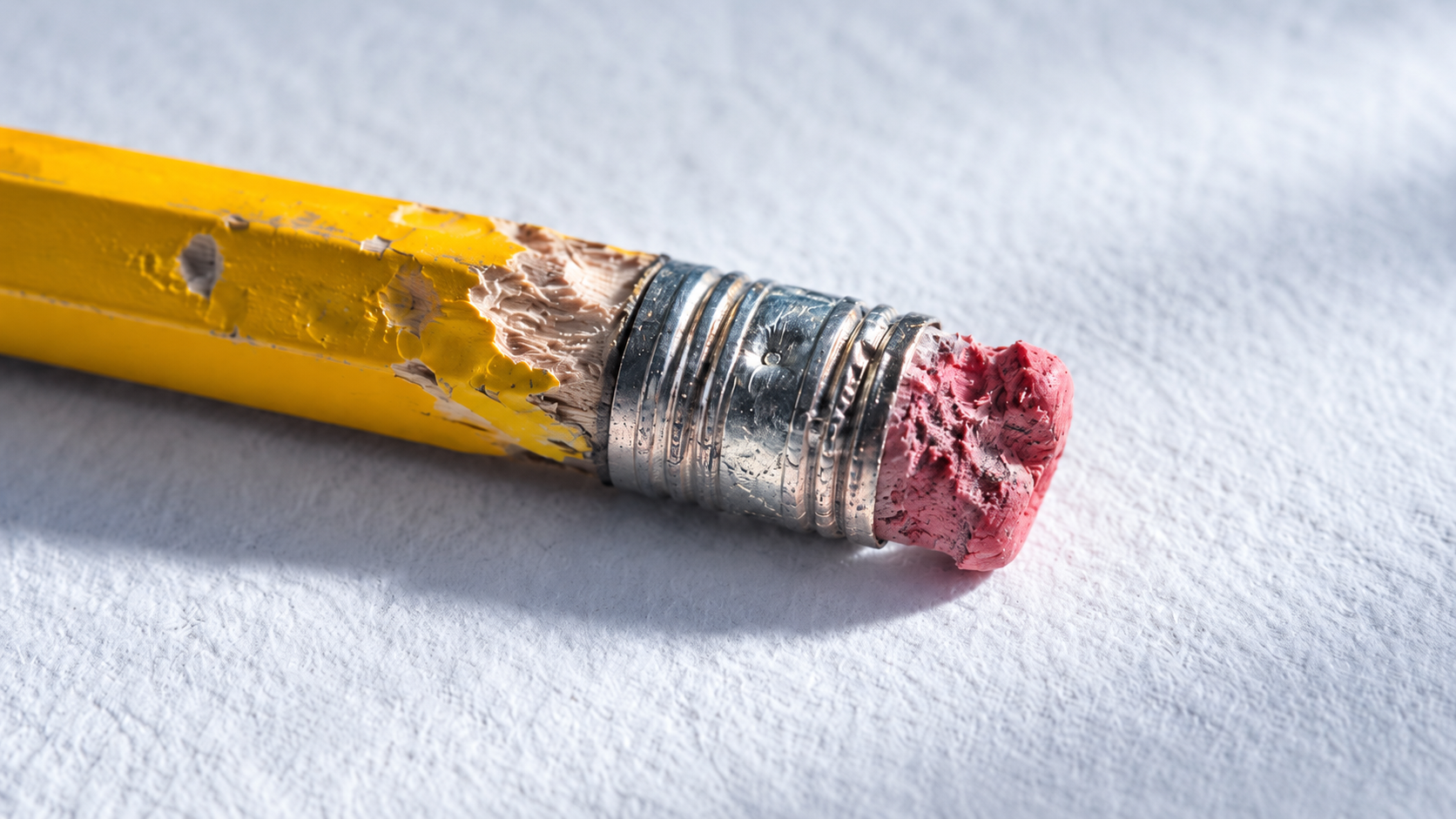
A polished idea isn’t automatically a good idea. Sometimes the horrible pencil sketch has more value than the immaculate mock-up because there’s actually a thought behind it. I have to remind myself of that too. It’s very easy to get excited when something looks good.
Then I start removing things
Once I think I’ve got the idea, my process tends to become less about what I can add and more about what I can get rid of.
Does that need to be there? Does that sentence need to be that long? Do we need another graphic? Is that colour helping? Can someone understand this in three seconds instead of thirty?
Design can have a tendency to become decoration if you’re not careful.
And I love making things look good. Obviously. I’m a designer. But looking good should be the outcome, not the entire idea. The best work for me is when something feels visually interesting because the thinking is clear.
This has taken me years to learn
When I was younger, I wanted every project to demonstrate that I could design.
More effects.
More tricks.
More visible effort.
You want people to look at something and think:
“Someone very clever has definitely used Adobe Illustrator here.”
Now I’m almost aiming for the opposite.
If I’ve done my job properly, it should feel natural. Of course that’s the logo. Of course that’s the colour. Of course the website works that way. It shouldn’t feel designed for the sake of being designed.
That’s really what PKO is about
Pop Kettle On isn’t supposed to be a mysterious creative methodology. It’s pretty literal.
Sit down.
Have a chat.
Work out what’s going on.
Then make something useful.
There will always be trends. There will always be new tools. There will always be another piece of software promising to revolutionise the creative process. I’ll probably try all of them.
But the bit at the beginning doesn’t really change. You still need to understand people. You still need to ask questions. You still need an idea. And sometimes the best design tool you’ve got is putting the mouse down and talking to someone.